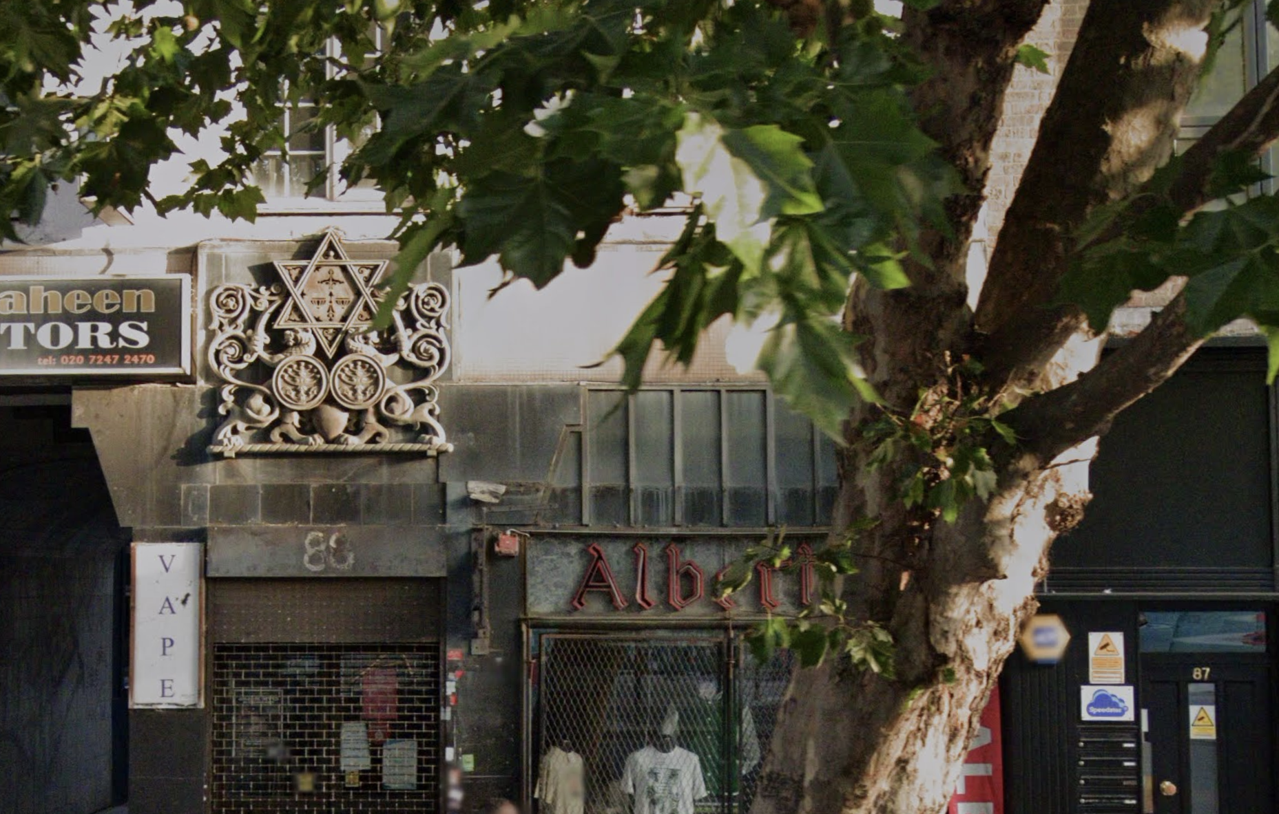
A building stands on Whitechapel High Street. Rising up over the doorway and to the right of the white sign with dark purple times new roman font that descends
V
A
P
E
Down to an easel advertising Jack the Ripper Walking Tours
And above the fading building number
Is a large emblem that looks like it's carved out of stone.
The building’s listing entry, earnt by this emblem, illustrates it in these most earnest details:
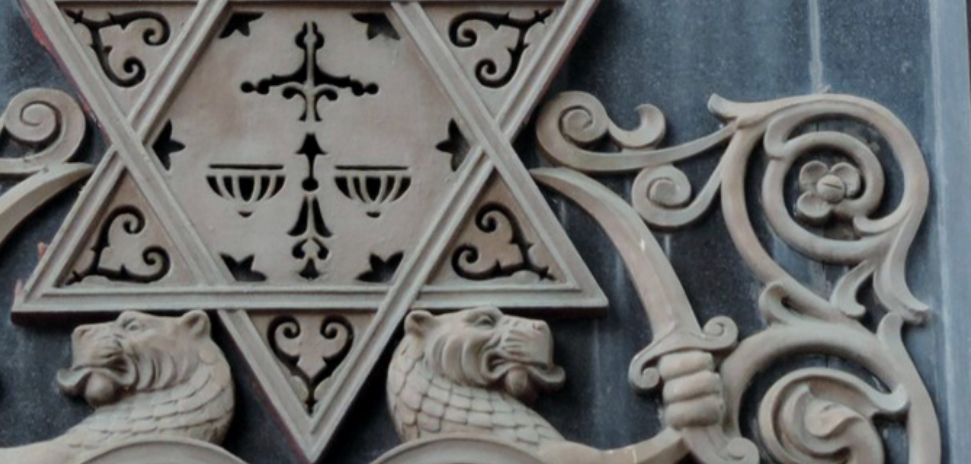
“The external decorative sign is… a metal relief, painted gold and fixed to the wall. The design is a Magen David, or Star of David, supported by two lions of Judah rampant and wielding sabres. Beneath is a pair of medallions, decorated with Menorot or seven-branched candelabra. The clawed feet of the lions rest on a thin turned base which is fixed to the wall.”
It suggests a grandeur that doesn’t quite sustain in reality. You might notice the emblem, especially if you are familiar with the symbolism. But you’d easily pass it by; another relic of something preserved for some reason or another on a London facade. I pour over a zoomed-in Google Street View angle, trying to click around an obstructing traffic light, to work out if, having surely walked past it before, I have ever stopped for it.
What you can really only find out from the listing, lest you find access to some niche and physical archives, is that the building housed the last year of the Jewish Daily Post’s relatively short existence. The exact length of the evening paper’s run is contested, likely due to mergers and name changes characteristic of newspapers. Nonetheless, from 1934-35, writers, editors and press operators entered the offices of the newspaper by passing under the emblem. According to the Survey of London, the paper was struggling against key rival Di Tsayt (The Jewish Times) when it was sued for libel following the publication of a scandalous story about a rabbi, finally sending it into administration.
In its entirety, the emblem is now used by the Jewish East End Celebration Society. In partiality, it is now used by us - Vashti Media.
A new logo
Over the last few months, Vashti has relaunched, reasserted. We’ve re-established ourselves as a workers’ cooperative with a bigger political and communal vision. We’ve built a new website and increased our output, publishing our flagship newsletter, The Pickle, every Friday, and web-articles from some of the sharpest leftist writers – both Jewish and non-Jewish – throughout the week. And we have more in the works, with an eye on events and more of the reporting and analysis that’s so needed at this moment.
As part of this relaunch, we, the editorial collective, commissioned designers, comrades and organisers Leigh and Zissel to work with us to develop a new logo for Vashti Media. This collaboration began with long conversations about why we do what we do. And not simply why we have done what we have done, but why we continue to do it. For me, these conversations were reifying, honing, in and of themselves. Such a project of collective critical engagement necessitates continual reconnection with our values, our individual and collective purposes.
As these discussions bloomed, so did mood boards of influence and sketches - of the word Vashti, a lone V, flourishes. Tensions in our intentions – balancing professionalisation with a rejection of the very classed and racialised notion of professionalism; complexity with clarity, accessibility – produced many, many iterations. We went through, and back and forth and through again, many versions of typeface and a long-pondering over what embellishment or flourish could come to represent us. To mark Vashti moving forward, and our continual intention of doing so.
Willing ourselves to be visible
With the finished design in front of me, I listen to Zissel on speakerphone, reflecting on what is now a completed commission, but far from the end of a collaboration. Gazing in sync at the small curves that now rest under the logo’s text, Zissel describes what led them and Leigh to walk around East London to seek inspiration for this additional flourish for the design: “[coming] here from the [United] States where Jewishness is more present everywhere…I’m looking for traces of my ancestors”. I agree – in the diaspora we are often looking for traces of ourselves. But, in living we are making our own markings. And, willing ourselves to be visible, sometimes risking our assimilation-bent comfortability, to be re-visible, is a responsibility of diasporic Judaism. Always, but particularly now, when our names and histories are being deployed to justify genocide.
Hearing me on this, Zissel recalls the feeling of using the siddur they had designed for the Jewish Bloc shabbat, on holding a printed artefact-to-be, that marks a movement of Jews who saw in their practice the imperative to organise for the freedom of all: “people will know that we were here and that we were gathering in this way”.
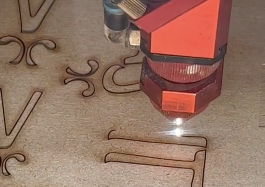
In order to make for Vashti a new way to mark ourselves as visible, connected to marks of those before us, Leigh and Zissel walked around the East End, to see what traces remain. We agree it would have been easy to find Jewish marks all over institutional archives, or to take inspiration from the designs on Judaica. Zissel foretells: “Whatever revolutionary movement that is going to come is going to be led by poor people”. As anarchist designers, it was important for Leigh and Zissel to take their bodies to trace the remnants of the East End’s working class Jewish immigrant community.
It was serendipitous that, of all the traces they gleaned, we collected around a tiny motif from the emblem on a Vape shop facade, a building embedded in a legacy of controversial Jewish newspapers. Touched by the connections, and in light of our continual return to a clipping from the anarchist newspaper Worker’s Friend from our original mood board, Zissel made us a wooden stamp of our new logo, such that it can be printed and printed and printed and printed.
To conclude this process of design, it feels important to sit with Zissel and reflect on the way we have come to represent Vashti with this logo. On how such making, together, in this slow anticapitalist way, was a refuge of sorts. We end the call and I sigh gently because it is healing, a rare remedy, to know someone through building with them. We have never met but I deeply care for them and Leigh. They text to invite me for shabbat. The logo is complete, but the work continues.
Never unremarkable
Vashti exists because we know to be true the importance of what has been and will be published here. Our contributors write to make markings of their lives. As do we.
I write this, too, so that it is kept - marked, archived, known. So that traces of this collaboration are preserved.
Our new logo reminds us that we follow in the footsteps of generations of radical publishers and papers; dissenting Jewish writers, artists and organisers; and a diasporic Judaism that has always taught that we are to build home exactly where we are.
But like all inheritances, ours are troubled. Look no further than the tiny embellishment under our name, drawn from inspiration upon passing an old emblem on an East End building designed, as it turns out, by an anti-Nazi cartoonist – Arthur Szyk – whose Zionsim was fervent and committed. A legacy we cannot accept, and from which we completely reject continuity. But there is something true in this unfortunate presence. It is a reminder of the reality of our own implication: in our families, our communities, our countries. It is our duty in taking seriously these inheritances to acknowledge them fully, and to confront, critique, change, reject; therein lies power.
Vashti, represented by this new logo, works to ensure that, well into the seemingly-nearing oblivion, it is unavoidably marked that the Jewish left are here, now, connecting, transcending, organising, making, writing, resisting and, most simply, living. May that never become unremarkable.
Asha Sumroy is an editor at Vashti.
H. Leigh Brown is a designer-researcher, writer, and facilitator of experiences, projects, and programmes.
Zissel Aronow is a queer community organiser from Philadelphia, currently based in London.
There’s no corporation or big advertisers behind Vashti – we're a workers' cooperative and rely on small donations to keep running. Support our journalism to help break the consensus.
To donate once, click here. To donate monthly, click here.
Author

Asha is an interdisciplinary writer and filmmaker and an Editor at Vashti.
Sign up for The Pickle and New, From Vashti.
Stay up to date with Vashti.